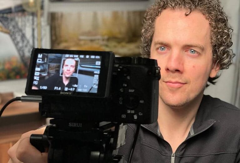
MrBeast is a very popular YouTuber who makes videos that are entertaining for kids and adults to watch. As of February 2022, he has 90.4 million subscribers, so there is a lot to learn from him.
To make a thumbnail like MrBeast, a YouTuber should include an image of their own face, be expressive, have the thumbnail represent the video, include few (if any) words, and keep it simple so viewers can understand the video quickly. Interesting facial expressions are the most important factor.
MrBeast is known for his insane, creative, and dramatic YouTube videos. He does challenges, competitions, giveaways, and more. He makes great videos, but in order to get people to watch, he is particular about his thumbnails and titles.
Thumbnail Categories
There are some categories that a thumbnail should hit that are simple to achieve and will make views go up when done correctly.
The categories are:
- The words in the thumbnail
- The number of faces in the thumbnail
- The overall emotion of the thumbnail
- The primary focus of the thumbnail
These categories are similar to different components of a formula that when added together correctly, get you lots of views. Something to remember is that MrBeast also has a following that will watch his videos without needing a good thumbnail or title because they love his videos and trust that they will be entertained. So, if you are a small channel looking to grow, then remember that a good thumbnail is not the only key to getting millions of views. Over time, good thumbnails, titles, and content will make you grow your channel and maximize the number of views you get.
So, why these categories? Well, when looking at all of his YouTube videos, you can see that his thumbnails clearly have a theme. So, after breaking it down, you can tell that the formula includes the words, faces, emotion, and main focus to make a thumbnail like MrBeast.
To see MrBeast’s thumbnails broken down and analyzed, look at the video below:
The different components of his thumbnails make a story that lets the viewer know what they are getting into when they click on the video. As a viewer, you can look at his videos and know what the video is in seconds. For instance, he has a video called “I Survived 24 Hours Straight In Ice”. In the video above, you can see it in the top left corner of the thumbnail. Without reading the title, you can tell that it is MrBeast looking cold and possibly worried or scared, and you know he will be in it for a long time because it says “HOUR 17”. This tells you that he is going to be stuck in freezing cold ice before you even read the video title.
The title of the video describes the thumbnail, and the thumbnail describes the title. It makes it simple and easy for viewers to understand. If the thumbnail is not able to be described in one sentence or described by the title, then it makes for a confusing thumbnail and title that together makes your viewers not want to click on the video.
How to Maximize Each Category
Now that you have an idea in your head about what a good thumbnail and a bad thumbnail look like and how to imitate MrBeast, you can move on and learn about how to use the categories listed to make a perfect thumbnail.
Words
The words on your thumbnail matter. First off, they need to be in a small amount so that viewers can quickly read and react to the picture. If you have a whole sentence, then it is hard to read, and it will make the font small and the thumbnail will look busy.
In the video above, Nate counts up all of the words in each of MrBeast’s past 200 thumbnails to see how many words were used per thumbnail. Nate included numbers as words as well; MrBeast will use numbers like $1, $10,000, 17, #2, and more, and these numbers count as one “word”.
In the video, Nate explains that only 16 out of 200 of MrBeast’s thumbnails used more than 4 words. He also said that 105 out of 200 thumbnails didn’t have any words in them at all! Leaving the remainder 79 out of 200 thumbnails to have only 1-4 words on them.
This tells us that the fewer words, the better. It is not saying that no words make a thumbnail better, but keeping it small is the best. The reason why is because it makes it easy for the viewer to read and understand the thumbnail. Then, they can read the title, and it tells the story that is in the thumbnail.
For instance, in MrBeast’s video titled “I Ate A $70,000 Golden Pizza” the thumbnail has only 2 words on it, and it is on a picture of MrBeast eating a large pizza. The two words are “GOLDEN PIZZA” with an arrow pointing to the pizza slice entering his mouth. For the thumbnail, the two words simply add context to the photo. So, words are important for context but should be used sparingly.
MrBeast was on a podcast with another creator, and in the interview, MrBeast talked about his thumbnails. He mentioned that he will shrink them down to the size they will look like on a phone and see if it is worth clicking on. This helps because you can see how it will look for most viewers before posting it. The majority of people watching YouTube videos watch on their phones, so making the words big enough to read, the facial expression dramatic enough to be noticed when scrolling, and overall making sure the thumbnail looks clean and not busy is important.
Face
The next category that makes MrBeast’s thumbnails great is the faces. This is important because the facial expression and the number of faces give a lot of context to the video. In the face category, the focus will be on the number of faces. Mainly, the thumbnails have MrBeast’s face on them, but, there are thumbnails with 2 people, 3 people, and more. There are a few that have a huge group on them.
So, how many faces makes for a good thumbnail? Out of 200 thumbnails, only 4 had 10 or more faces. 29 videos had 2 faces, and the majority of thumbnails had one face. The one-face thumbnails were mostly composed of MrBeast’s face himself, and in total there were 110/200 thumbnails with one face.
This doesn’t quite tell you to not have multiple faces in a thumbnail, but it does tell you that having one face gets a lot more action. This makes sense because it provides a simple interpretation. Other thumbnails can look busy or confusing when having more than one face, but other times it has helped MrBeast show the large scale he wants. His videos are always big, dramatic, and scaled out to be as big as possible. Unless he finds a purpose for having more faces or a group of faces on a thumbnail, then he doesn’t do it. This helps keep it simple for viewers.
Emotions
The emotions help a lot with getting clicks on videos. MrBeast has a lot more happy/excited emotions in his facial expressions than any other emotion. He also has many videos with shocked expressions that do very well too. A smaller portion of videos has angry or neutral emotions.
This tells us that generally, positive and shocking videos are more likely to be viewed. You can use this to understand why your videos are or aren’t being watched. Does the thumbnail make sense on its own? Does it make sense with the title? What is the overall emotion? If it is negative, then you need a good reason as to why. But, if you want to attract viewers, then be positive or shocking.
The emotion should also tell the viewer what to expect. Is there something shocking that they should expect? Is there something cool, fun, or interesting to expect? Should they become upset or angry with something in the video? If a person wants to enjoy a video, they will choose a more positive thumbnail. Otherwise, they are at risk of getting into a mood they do not desire. So, if a viewer wants to feel happy, excited, wowed, or shocked, then they will find a thumbnail that conveys those things and click on that.
Main Focus
The last thing to worry about is the main focus. You do not want the thumbnail to have an unclear purpose or meaning. If someone cannot tell what the video is by the thumbnail, then they will not click. The purpose of a thumbnail is to get people to click on your video, so making the main idea or main focus unclear will confuse the viewer, and they will keep scrolling.
You have less than 3 seconds to impress someone enough to watch your video, so keeping your thumbnail straight to the point will help reduce the confusion and questions a viewer will have. They want to know what to expect in the video. They want to know the content, the emotion, the scale, and the dramatics of the video. So, give them that information so that they don’t scroll past without batting an eye.